Architecture & Art > Modernism Architectur > Architecture and Furniture
Architecture and Furniture
Architecture and Furniture I
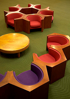
Two types of chairs for the lounge

Isamu Kenmochi (1912-1971) was a pioneer of modern interior design and revived Japanese traditions as “Japanese modernism”. He continues to be highly regarded in Japan and around the world for establishing the firm status of Japanese aesthetics in the global design world. In 1958 he won the grand prize for a collaboration with Kunio Maekawa at the Japanese display at the World Exhibition in Brussels. In the same year, he collaborated with Kenzo Tange on the Kagawa Prefectural Government Hall, as well as actively taking on joint projects with other architects.
Essentially, furniture is a tool that may be moved, in contrast with the fixed nature of architecture, and we believe that it fulfils its function in the gap between human activity and architectural spaces. The chair is the closest piece of furniture to the human body because it is nearest to clothing, which directly interacts with the human body, and it is essential in modern life.
It must have been the autumn of 1964 that architect Mr. Sachio Otani asked me to help him with the furniture for ICC Kyoto and showed me his drawings and models. No matter how hard I studied the drawings, I couldn’t imagine all the details, so he showed me the worksite. At that time, steel beams had been erected, and the floor concrete was being cast. I was astonished at its size, especially the gigantic interior space, and I remember wondering how I could harmonize this structural scale with the human scale, and concluding that I might have to win by force rather than harmonizing.
‘Architectural interiors have two elements. One is the structure of the interior spaces – the composition of the large framework will determine this. The second is the skin of the interior spaces – the elements that will directly touch the human skin and appeal to the emotions.’ I think Mr. Otani said that, but the shock I received from this worksite was much larger, and I especially sensed the difficulty I would have conceptualizing the relationship between the furniture and the gigantic space that would be supported by this angled structure.
The next time I visited, the interior was nearing completion, and the structure was covered with rough precast concrete. Viewing this, we decided to finish the lounge chairs with a thick, sheltering exterior of clearly-grained wood, and a soft fabric cushion on the interior to warmly welcome the body.
By their natures, chairs seem to have a somewhat stiff expression. Filling the space with only this element would be nothing less than irresponsible. The tea lounge has an open format and faces the lake, so I decided on upholstered chairs made of soft curves. The differences in the characteristics of these two chairs are linked to their particular functions, giving a sense of inevitability to their materials and forms.
Mr. Otani told me that ‘conferences are officially held in the conference hall, but unofficially, they are held in the lounge as well.’ That meant that the lounge chairs needed the functionality of being ‘clustered yet separate’.”
Architecture and Furniture II
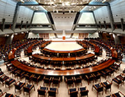
Furniture for an international conference hall


I wish I could say that the chairs designed for the lobbies of the smaller conference rooms matured for four or five years in my sketchbook, but it would be more accurate to describe them as ideas that had been rejected many times before being accepted. They were rejected over and over for one reason or another, and each time, I tried to add improvements and present them again. This was again a battle with the demands of the architecture. Finally, I inserted soft cushions into an exterior of molded plywood and came up with small easy chairs and benches for the low-ceilinged lobby, and I also designed tables of the same molded plywood construction.
We also made the tables and chairs for the smaller conference rooms. I proposed creating unit tables so they would be movable and combinable into circular, oval, and horseshoe shapes. Even so, I prioritized a sense of weight appropriate for an international conference and avoided making them look too light. We took great pains to use especially large joints to prevent mismatching table surfaces from standing out when tables were combined. Even so, I never imagined that this movable format would become as popular as it has today.
The conference chairs were covered with FRP material to make them light. I also remember that we had a big debate in the design stage about making them a comfortable fit for larger-figured attendees from overseas.
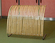
Another memory is designing the stanchions (barriers) after the inu-yarai fences of a Kyoto machiya townhouse. Mr. Otani’s designs are very well thought out, and they appear to be a complicated spatial structure, so I thought there wouldn’t be much conflict between participants and the press. Even so, there are ways through, so some locations needed barriers, but I didn’t think that existing products would be suitable for this building, so I decided to design them. I thought they should be light, carriable, stackable, and clearly convey “do not enter”. I took a hint from inu-yarai, which were originally used to repel dogs, and I attached two sheets of bamboo molding material to a stainless pipe frame using bolts. I ended up designing a reporter repellant!
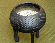
I also created the benches, dustbins, and ashtray stands used outside out of Shigaraki-yaki ceramics. I remember that I had trouble drawing the hailstone pattern on the outside of the Takaoka-made cast-iron legged pots used for the ashtray stands. In any case, I am very grateful that this furniture is being used with such great care 40 years down the road.
Text contributed by: Mr. Tetsuo Matsumoto, President, Kenmochi Design Associates
